ToolTip in WPF
Tooltip is a very important part of UI design for information display, It shows information when the mouse is brought over elements. Tooltip is a small pop-up window that appears when the user moves the mouse pointer over an element. The tooltip appears for a specified time interval. If the mouse pointer is moved away, the tooltip window disappear.
In WPF, the ToolTip class is provided to manage and display the tooltip. ToolTip property is defined in FrameworkContentElement and FrameworkElement both so you can use ToolTip property of any element which is Drive from these classes. ToolTip property is ContentControl, which means that the content of tooltip can be single-line text, multiline text, shapes, images or any visual content. simply it can contain a single object of any type.
Creating a Tooltip
In XAML
Show single line text in the tooltip.

        <Button ToolTip="Save Information"
                Height="30" Width="50" Content="Save"></Button>
Show multiline Text in the tooltip.
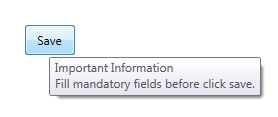
        <Button Click="SaveInformation" Height="30" Width="50" Content="Save">
            <Button.ToolTip>
                <ToolTip>
                    <TextBlock>
                        Important Information
                    <LineBreak/>
                        Fill mandatory fields before click save.
                    </TextBlock>
                </ToolTip>
            </Button.ToolTip>
        </Button>
In C#
Create a new object of ToolTip class and define its content and assign it to control ToolTip property
            Button btnSave = new Button();
            btnSave.Content = "Save";
            ToolTip tt = new ToolTip();
            tt.Content = "Save Information";
            btnSave.ToolTip = tt;
or assign content directly to the control ToolTip property
            Button btnSave = new Button();
            btnSave.Content = "Save";
            btnSave.ToolTip = "Save Information";
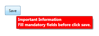
Tooltip Properties
ToolTip class provides many properties to customize the ToolTip behaviour and display, like Background, Foreground, FontSize, FontWeight, IsOpen and etc. See below example
        <Button Click="SaveInformation" Height="30" Width="50" Content="Save">
            <Button.ToolTip>
                <ToolTip Background="Red" Foreground="White" FontSize="13" FontWeight="Bold">
                    <TextBlock>
                        Important Information
                    <LineBreak/>
                        Fill mandatory fields before click save.
                    </TextBlock>
                </ToolTip>
            </Button.ToolTip>
        </Button>
Style a Tooltip
You can style a ToolTip by defining a custom style
        <Style TargetType="ToolTip">
            <Setter Property = "Background" Value="LightBlue"/>
            <Setter Property = "Foreground" Value="Purple"/>
            <Setter Property = "FontSize" Value="14"/>
            <Setter Property = "FontWeight" Value="Bold"/>
        </Style>
See the complete code
<Window x:Class="TooltipExample.MainWindow"
        xmlns="http://schemas.microsoft.com/winfx/2006/xaml/presentation"
        xmlns:x="http://schemas.microsoft.com/winfx/2006/xaml"
        xmlns:d="http://schemas.microsoft.com/expression/blend/2008"
        xmlns:mc="http://schemas.openxmlformats.org/markup-compatibility/2006"
        xmlns:local="clr-namespace:TooltipExample"
        mc:Ignorable="d"
        Title="MainWindow" Height="350" Width="525">
    <Window.ToolTip>
        <Style TargetType="ToolTip">
            <Setter Property = "Background" Value="LightBlue"/>
            <Setter Property = "Foreground" Value="Purple"/>
            <Setter Property = "FontSize" Value="14"/>
            <Setter Property = "FontWeight" Value="Bold"/>
        </Style>
    </Window.ToolTip>
    <Grid>
        <Button Click="SaveInformation" Height="30" Width="50" Content="Save">
            <Button.ToolTip>
                <ToolTip>
                    <TextBlock>
                        Important Information
                    <LineBreak/>
                        Fill mandatory fields before click save.
                    </TextBlock>
                </ToolTip>
            </Button.ToolTip>
        </Button>
    </Grid>
</Window>
another way, define style within the control
<Window x:Class="TooltipExample.MainWindow"
        xmlns="http://schemas.microsoft.com/winfx/2006/xaml/presentation"
        xmlns:x="http://schemas.microsoft.com/winfx/2006/xaml"
        xmlns:d="http://schemas.microsoft.com/expression/blend/2008"
        xmlns:mc="http://schemas.openxmlformats.org/markup-compatibility/2006"
        xmlns:local="clr-namespace:TooltipExample"
        mc:Ignorable="d"
        Title="MainWindow" Height="350" Width="525">
    <Grid>
        <Button Click="SaveInformation" Height="30" Width="50" Content="Save">
            <Button.ToolTip>
                <ToolTip>
                    <ToolTip.Style>
                        <Style TargetType="ToolTip">
                            <Setter Property = "Background" Value="LightBlue"/>
                            <Setter Property = "Foreground" Value="Purple"/>
                            <Setter Property = "FontSize" Value="14"/>
                            <Setter Property = "FontWeight" Value="Bold"/>
                        </Style>
                    </ToolTip.Style>
                    <TextBlock>
                        Important Information
                    <LineBreak/>
                        Fill mandatory fields before click save.
                    </TextBlock>
                </ToolTip>
            </Button.ToolTip>
        </Button>
    </Grid>
</Window>
In the next articles, we will read about
- How to Position a ToolTip?
- How to Customizing the ToolTip Control?
- How to use ToolTipService?
- How to change the display time interval of ToolTip?